extract essentials of oregon grape

51
Created on 99designs by Vista
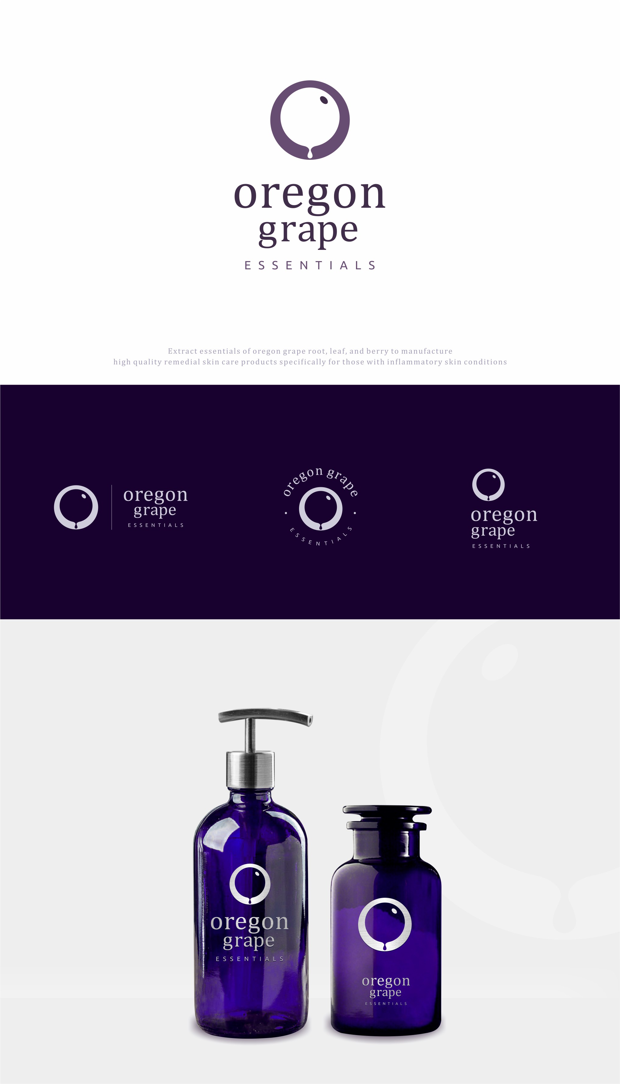
This logo is conceptualized when contest owner ask in the briefing to use the letter O as a reference, and I use the negative space of the letter O to describe the Oregon Grape with a simple, easy to remember but luxurious look, and keep it from being seen dessert products.
and there is also an illustration of water droplets in it because this product takes the main essence of Oregon Grape (only an illustration of berries but is enough to represent the Oregon Grape plant).