
Created on 99designs by Vista
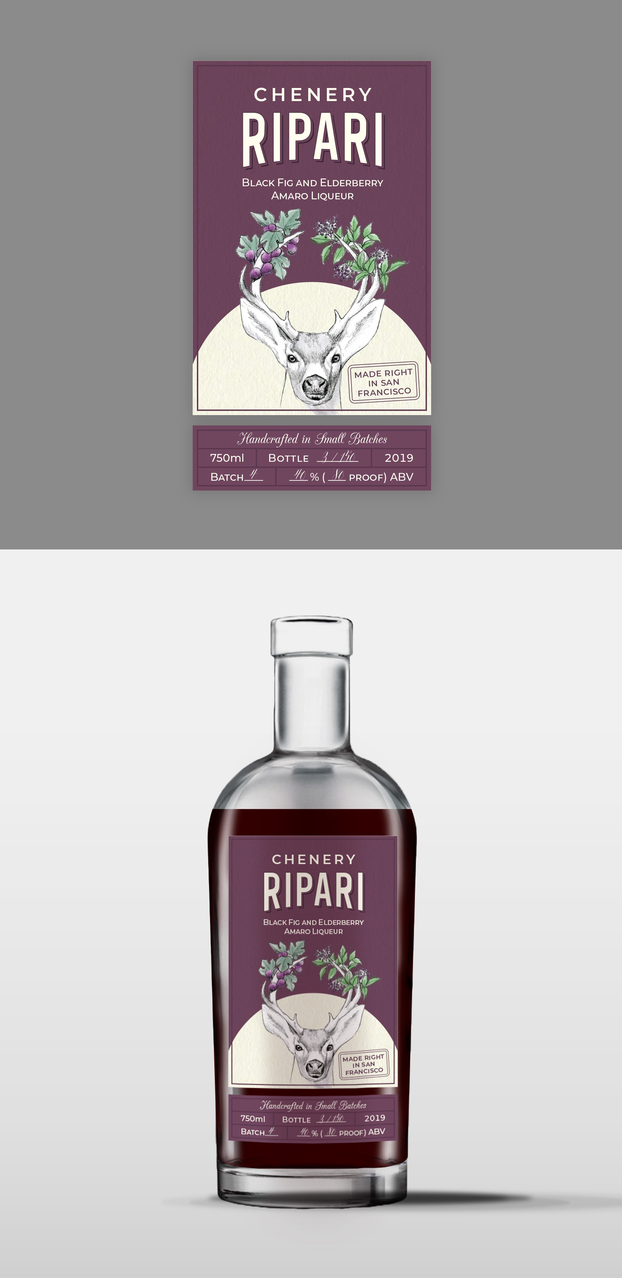
The general design idea was to design a clean and modern label with some traditional characteristics (especially on typography, commonly used on handcrafted drink labels, to make it look less industrial). The beige circle creates foreground, which helps illustration - the centerpiece of the design, be more prominent. Other elements are subtle and elegant, but not boring.