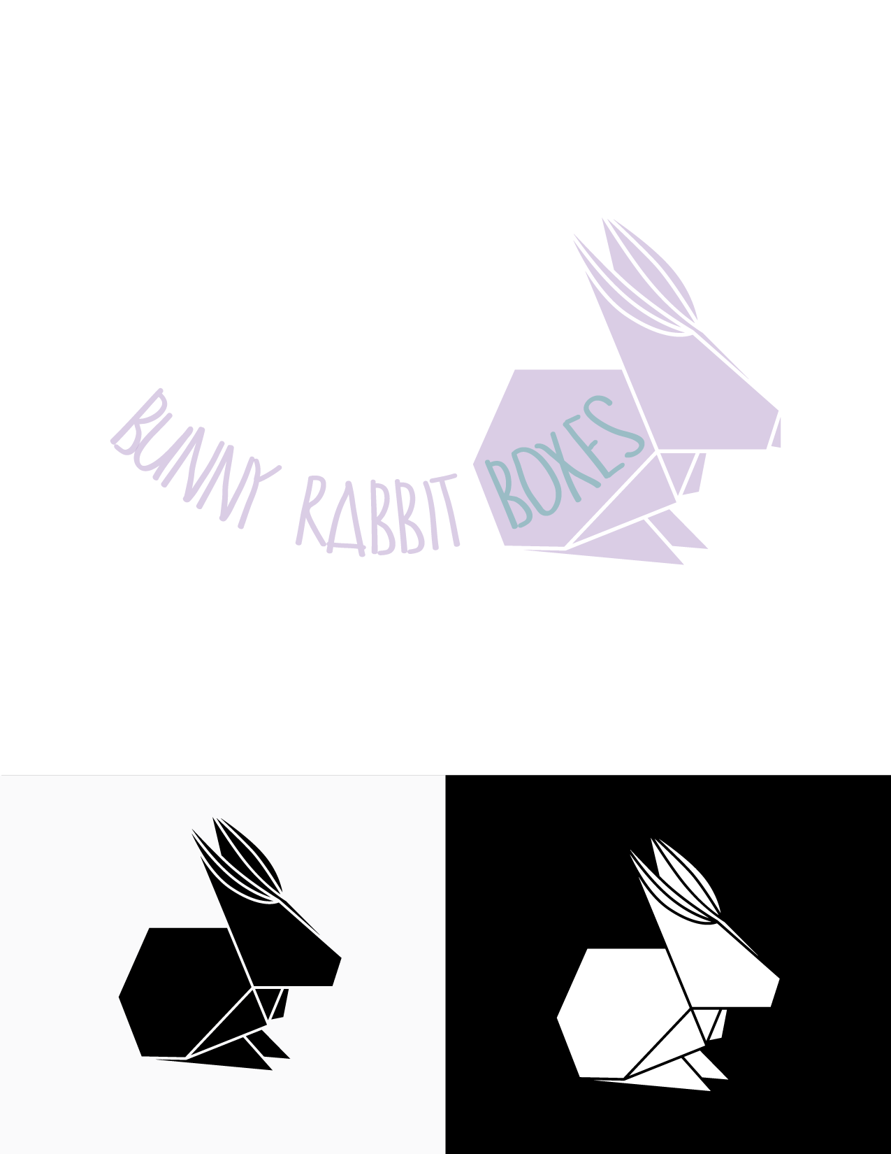

Given the nature of this business's activity - putting together and selling refined gift boxes dedicated to babies - and in congruence with the name to be incorporated into the logo (Bunny Rabbit Boxes), I have chosen to design an origami-inspired logo. The colors I used closely subscribe to those indicated by the client and show soft, pastel nuances. By curving the text, I tried to add dynamicity to the logo, but it also suggests a rocking movement (like of the cradle). The font I used is a handwritten one and I chose it in order to balance the sharp angels and the straight lines of the origami bunny, but also because of the link I saw between the paper suggested by origami and handwriting. The word "Boxes" is framed by the bunny, reinforcing the interrelation between object and word, between matter and meaning.