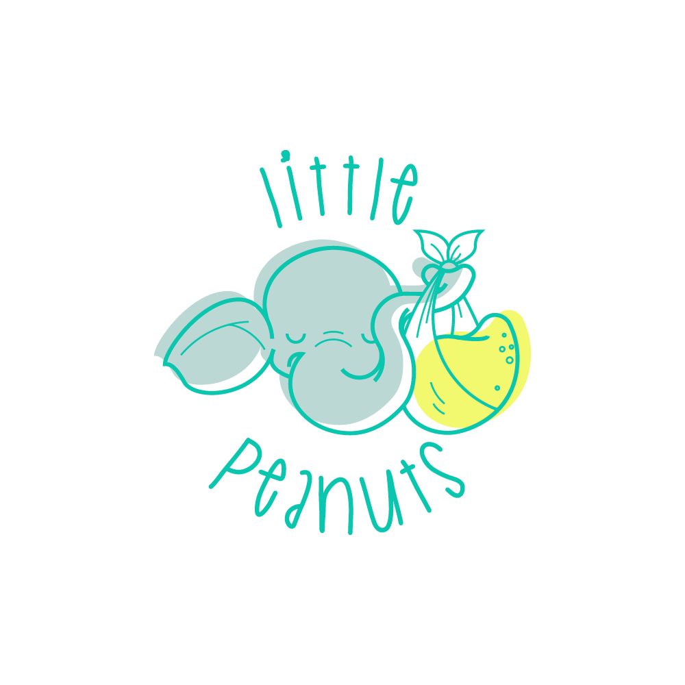

In creating the logo mark, I wanted to obtain a clean and clear image, yet playful and fun, with an attention to detail, but limiting it to some subtle accents. I tried to make good use of the brand’s name, thus using, as a logo mark, the image of a cute elephant, holding a peanut in a cloth bundle with its trunk, referencing the symbol of the stork delivering babies. I tried to give the image a calm and balanced feeling, through the curves and sinuous lines and through the composition. I chose to use a limited color palette, in subtle, yet bright tints – blue, gray and a drop of yellow (in order to indicate the stylized peanut). The font I used is playful, yet simple and readable even from a distance. I tried to put the image and the text in an organic relationship, so that, together, they would form a unitary whole.