Simple stylized characters

0
Created on 99designs by Vista
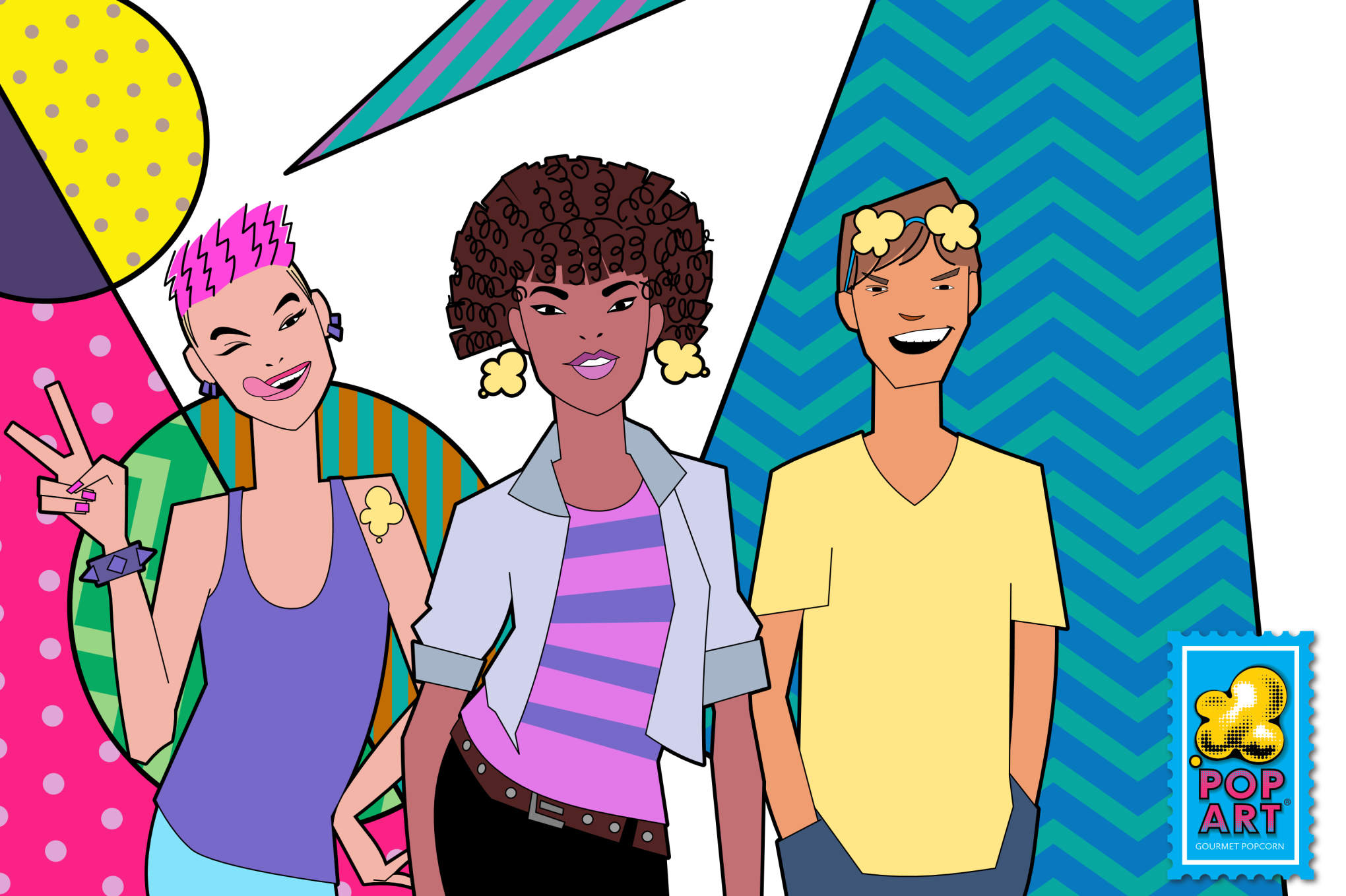
An alternative design for three characters for the Pop Art Snacks brand. I was aiming to make characters that would integrate well with the design elements seen on the package design for the brand (roughly repeated in the background of the characters). I ended up designing the characters as being flattened, composed of simple shapes and sharp angles with a minimum of detail.