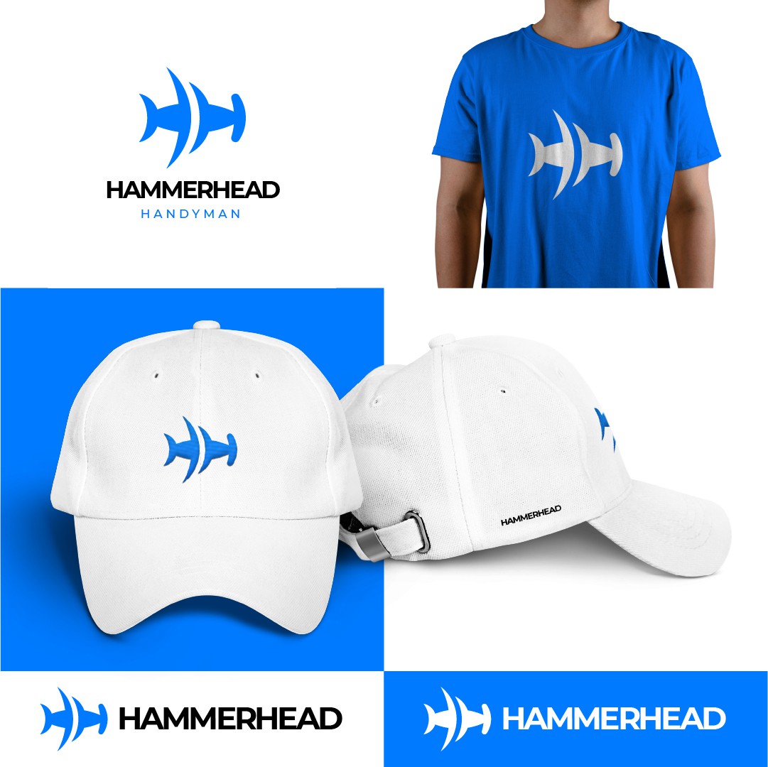

This is a subtle hammerhead shark split into 2 Hs, which come from your initial letters.
As you can see, it is not too detailed, but enough to complement the name and make you think - Aha, that is a hammerhead shark.
This minimal approach will help you use the logo in any size - big or small - on any material or application.
In terms of colors, I picked a saturated, but medium blue. Of course, I can adjust that if you think there are better options.
The font is one of the best ever created, Montserrat, and it is free to use, of course. I played with the thickness and the letter distances of the second word so that it also stands out nicely, but without being too distracting.
To help you imagine your future brand easily, I placed a t-shirt and the caps using the visual identity.