
Created on 99designs by Vista
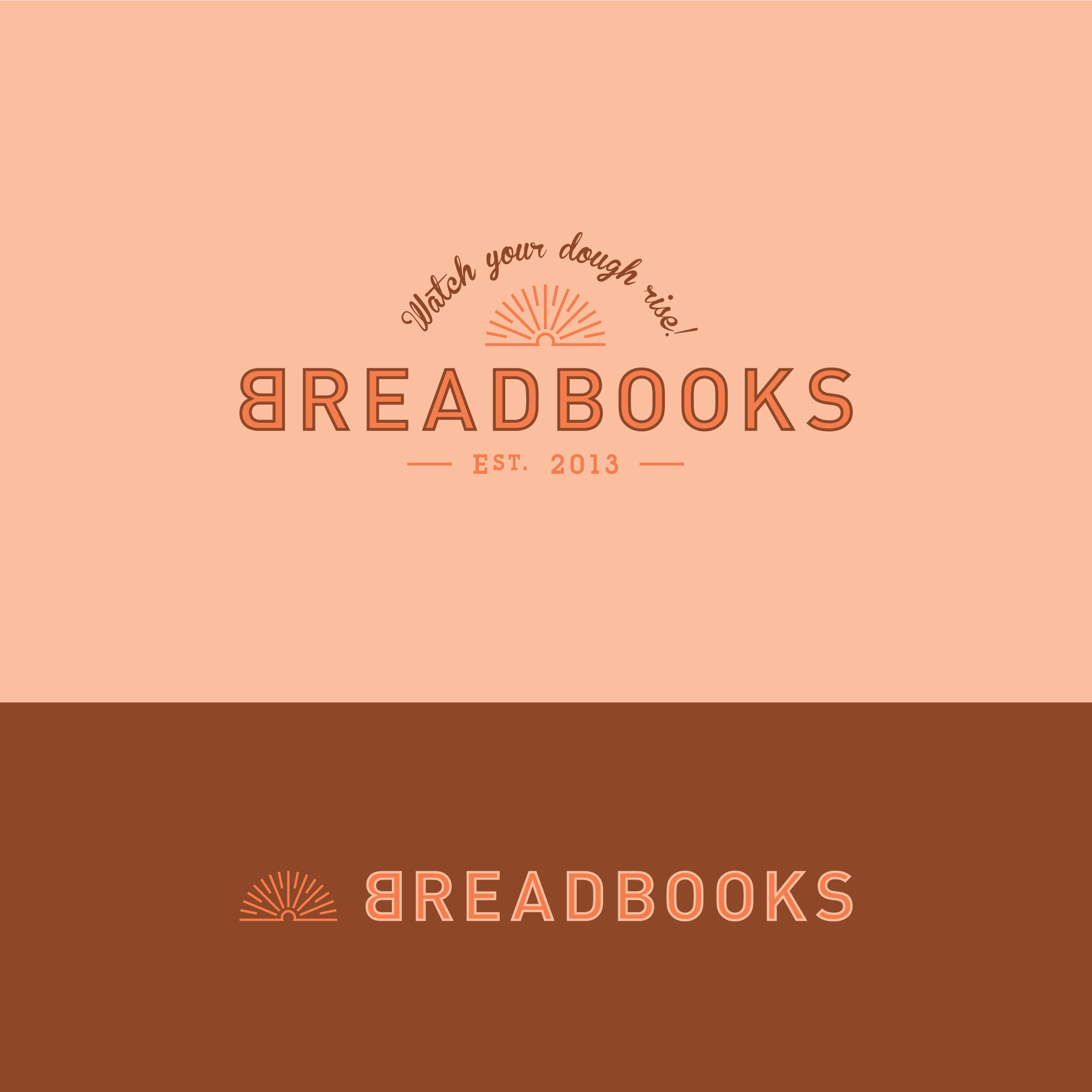
Connecticut based financial and marketing start-up, BreadBooks, specified an identity that initially suggests the business had been around for a lot longer than they actually had.
This particular combination of font arrangement and monochromatic colour palette was selected to promote a vintage aesthetic. The open book motif represents financial transparency within business and is styled to resemble the rising sun in line with the company’s strapline: Watch your dough rise!