Logo and brand guide for a technology startup

65
Created on 99designs by Vista
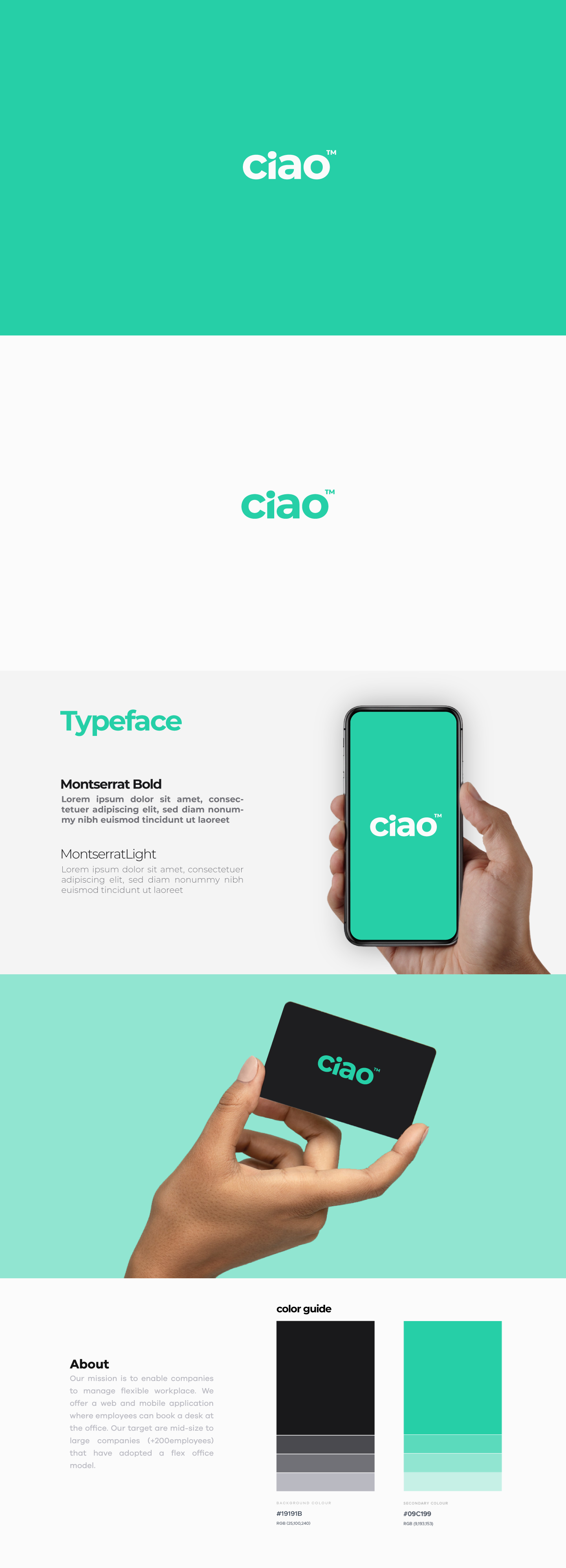
Logo and brand guide for a company that enables other companies to manage flexible workplace. They offer a web and mobile application where employees can book a desk at the office.
Came up with a unique wordmark, with a great fell of “simplicity” and “approachability” (round fonts), which stands for their brand values. The “i” letter levels up all the other letters and give a great balance to the logo. The boldness of the font gives a sense of security and competence (feels that they know what they do and they are not afraid to share it). The bright color suggests that the company brings the innovation feel.