The logo colors of entertainment
Harness the psychology of color to build your brand.

by BATHI
Get ready for your closeup
The entertainment industry makes its money convincing us that fantasy is reality. In order to get consumers to watch their movie, subscribe to their station, or play their video game, entertainment industry professionals must convince us that they’re engaging and relevant. Sometimes this backfires, however, and they fall into the fake and over-the-top stereotypes that plague Hollywood.
So how do you choose a color for your entertainment logo that will help consumers escape reality but also speak to your credibility as a storyteller? We’ve analyzed the color palettes of over 500 entertainment industry logos, evaluated the brand personality traits that business owners want, and consulted color psychology experts in order to help you decide.
Shooting in technicolor: the breakdown of entertainment industry colors
-
 All data visualizations designed by MH Designs.


Early cinema started out in black and white, and these two colors still conjure up the glamour of classic Hollywood. It’s not surprising, therefore, that black and white are the two most popular entertainment industry logo colors requested in 99designs contests. But not everyone in entertainment—which also encompases video games, music and live theater—is interested in associating themselves with the glory of a bygone era. When they want to experiment with color, entertainment industry professionals request blue and red.
Who doesn’t get cast? Pink and brown. The soft and earthy associations of these two colors apparently don’t play well with the glamour and excitement of the industry.
The colors preferred in 99designs contests, however, were not on trend with industry leaders. The top entertainment companies favored blue in 63% of their logos, and overall had very colorful marks, with six colors—blue, black, white, brown, red and yellow—all appearing in at least 25% of company logos.
The top four entertainment industry logos are fairly emblematic of what we see across the top brands:
The top four entertainment industry logos are fairly emblematic of what we see across the top brands:
Three have blue. Two black. And one features the whole rainbow. The Comcast logo is particularly interesting as most people would identify the multi-colored mark as the NBC peacock. Comcast acquired NBC Universal in 2009. By taking the peacock logo as their own, is Comcast attempting to distance itself from its reputation for poor customer service, and instead take on the more favorable brand personality associated with the National Broadcasting Company, the home of beloved programs like the Olympics, The Today Show, and Modern Family?
Reputation and brand personality go hand in hand. And once you know what you want your brand personality to be, it’s easy to translate those traits into colors.
Listening to the music: colors of brand personality in entertainment
Start determining your brand personality by asking yourself these six questions:
- Gender: Is my brand traditionally masculine or feminine?
- Tone: Is my brand playful or serious?
- Value: Is my brand luxurious or affordable?
- Time: Is my brand modern or classic?
- Age: Is my brand youthful or mature?
- Energy: Is my brand loud or subdued?
We'll use your answers to see what logo color works best for you.
Here's how entertainment and arts businesses on 99designs define their brand personalities:
-
We analyzed the preferences of all industries and assumed normal distribution. Preference strength was figured on number of standard deviations from the mean.

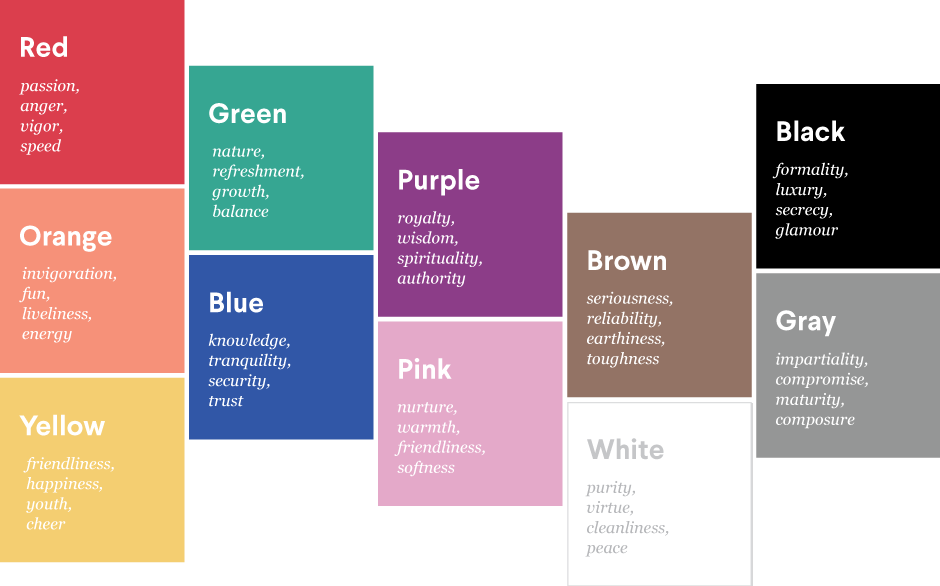
From this we know that entertainment industry professionals want to be seen as playful, loud and youthful. These traits align with the following colors:

In 99designs contests, there’s a sharp discrepancy between what we actually see—black and white—and the bright rainbow of warm colors we’d expect to see given the desired brand personality traits.
Both red and orange are seen as playful, loud and youthful. We do see red requested in 34% of contests, but orange only appears in 13%. The youthfulness of purple and pink should make them popular, as well, but in reality they are among the least popular entertainment colors requested or appearing in industry leading logos.
Gray, which is known for its maturity and composure, shows up in a surprising 20% of both contests and industry leading logos. This is likely because it is a neutral color; even if it has low associations it will appear in a high number of logos.
Taking artistic license: what colors should showbiz professionals consider?
Some entertainment industry professionals are caught up in the old Hollywood black and white glamour. But what if you’re ready to make the jump to color? There are a few underutilized colors that can make your brand stand out.
While it’s not surprising that blue, the world’s favorite color, is quite popular, it has fairly neutral associations with all of the traits that those in the entertainment industry are looking for. However, its cultural associations of knowledge and trust could provide helpful to an entertainment company looking to develop their credibility (I’m looking at you, Comcast).
Purple, pink and orange are all youthful, yet they appear in fewer than 15% of both 99designs contests and industry leading logos. If you want to stand out, consider the authority which purple brings to your brand. If exuding energy is more your thing, think about orange. Or if you really want to shake things up, take ownership of your friendly side and think pink.
Here’s how some industry leaders are using or bucking trends to their advantage:
-
The Jim Henson Company, a family entertainment business known for the Muppets, channels the youth and playfulness of red to bring whimsy to their brand.
-
American Zoetrope, a studio founded by Francis Ford Coppola & George Lucas, intelligently uses black and white. Their brand, known for classics like Apocalypse Now, uses the time-honored Hollywood duochrome to equate their brand with quality storytelling.
-
Tivo reinvented the way we watch television. Their multi-colored logo pairs classic black and white with playful, exciting red and orange. This combination mirrors what they do: bring a classic medium up to date by changing the way we consume it.
As you conceptualize your entertainment industry logo, you’ll want to think about what, specifically, your brand’s place is in the marketplace. Entertainment companies create products that are meant to appeal to a wide variety of markets; while a vast majority target young people (and therefore want exciting, youthful logo colors), some have a very specific audience in mind.
Color is a personal choice, but understanding color psychology in marketing can help you make an informed decision for your small business. So are you sticking with the classic Hollywood black and white? Or are you going to break the mold and use a youthful purple to set yourself apart from your competitors? No matter what you decide, your logo design is sure to entertain!
Blue collar, white collar, purple collar: what are the colors of other industries?
Get an entertainment logo design now!
Want to know more about how design impacts business?
Subscribe and be inspired by our best tips, trends and resources.
We'll also send you the occasional marketing email and promotion (which you can opt-out of anytime).